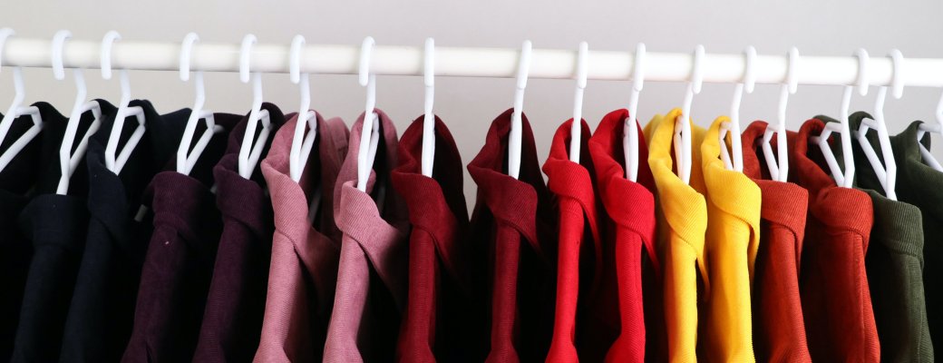
Personalizing textiles such as T-shirts, hoodies and jackets is more popular than ever. You have a wide choice from various collections and can personalize each one with your own design. This allows you to convey your message in an original way.
A design can look very impressive, but what do you need to bear in mind? Here are a few practical tips for you!
Often the placement of the design on a T-shirt, for example, can be different than expected. For example, a standard placement on the front of the shirt is not halfway between the top and bottom of a T-shirt, but about 10 centimeters (4 inches) from the collar. When choosing the printing we always indicate in orange the approximate position of the print. On the digital preview you will receive after placing your order you will see where your print will be placed.
Often a way too large size for the printed logo is wanted . Consider the purpose and features of the shirt and the characteristics of the design. Certain shapes and designs look better and come across stronger when they are smaller than standard. This applies, for example, to textiles that will be worn regularly. For purely promotional textiles, for example to promote a product or event, it can be interesting to print your message as large as possible.
In addition, the maximum decoration size depends on the smallest textile item in that same production. Theoretically, you could print an XXL with an A3+ design. However, when XS ladies or children's models are included, they determine what is effectively possible in practice.
The proper arrangement of elements with each other is important. A common mistake is that elements are stacked in top of each other or too far apart. Often it is difficult to read in this way, which may cause people to misinterpret it. Also, the design can become unbalanced, drawing attention to the wrong place.
 A font unconsciously conveys a lot of information, ideas and emotions. So make sure the font fits your company and message.
Arrange the words on the shirt so that it is a logical, visual arrangement. In addition, make sure that the letter spacing and line spacing are correct and that the words fit with the elements of the image and look attractive.
 A rich variety of colors to make the design more lively and enthusiastic can be tempting, but certainly counterproductive. The chance of clashes and colors not matching well is greater this way. Also, the amount of colors and decoration techniques chosen affect the price. The more colors chosen, the higher the setup cost and price per piece.
Will you choose 100% cotton, mixed material, or rather socially responsible textiles made from organic and ecological materials. In addition to choosing a round neck or V-neck, you should also think about the right thickness of material, depending on the purpose of the product and its use. Promotional textiles can often be thinner and cheaper, whereas clothing for personnel or to be sold can often be thicker and of higher quality.
This is a visual difference between the lighter and darker parts of an image. Designs with high contrast are easier to read and designs with low contrast are often more subtle. Bright colors on a dark background, for example, create high contrast. Also, a striking image along with saturated colors will increase contrast against a neutral background.
 Keep it simple. This applies aquelly well to designing T-shirts and other textiles. With a T-shirt design, you are usually a moving target and have limited viewing time. In addition, people often stack things on top of each other and use odd compositions which can make for a chaotic mess. Choose one main image or idea and remove unnecessary things that are not essential to getting your message across.
To embroider textile items, we need your design as a vector file. You can read more about what a vector file is here.
With these things in mind, you will undoubtedly score with your personalized textiles. Start designing now.
Would you like more information about the layout guidelines for textile items (PMS or CYMK, cutting marks, PDF setting, etc.)? Be sure to check out the information page. We're always here for you if you have any questions.